Mid-century modernization
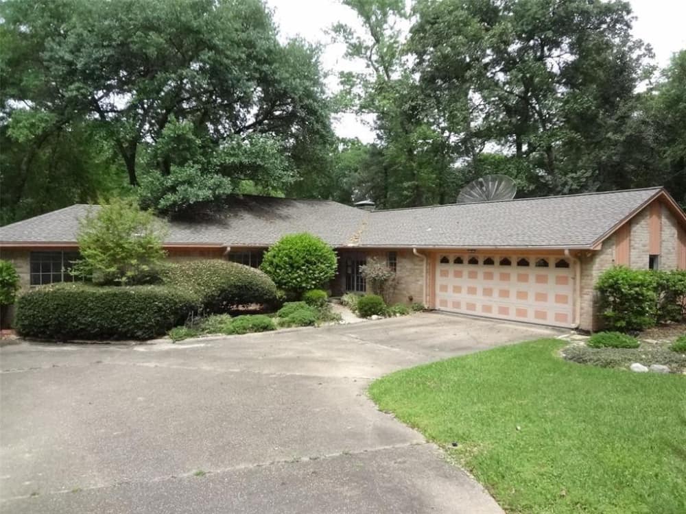
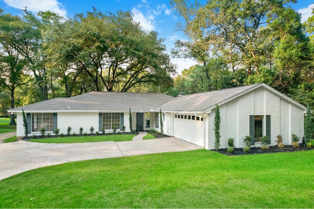
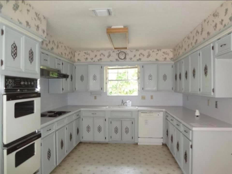
What started as a classic 60s home with all-original everything culminated in a contemporary take on what makes mid-century modern so appealing. The challenge then became how to update this home without sacrificing its character. Our answer? With great care and attention to detail.

2,577 sq feet of possibility
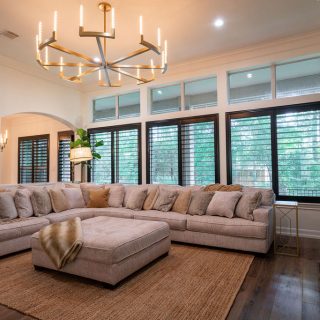
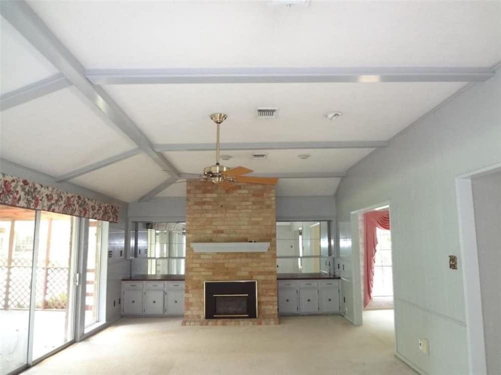
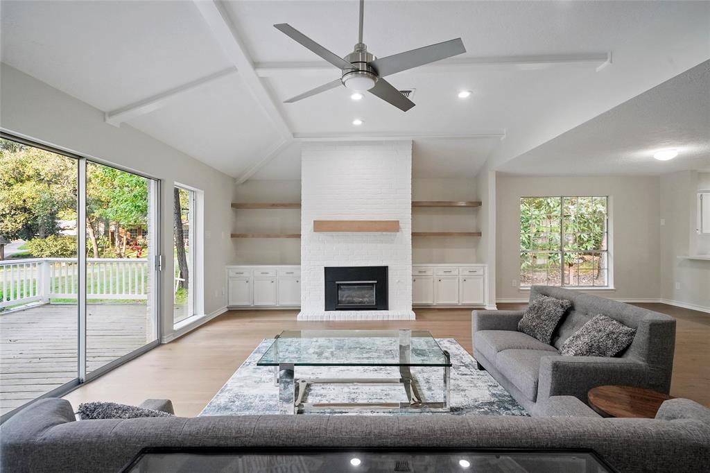
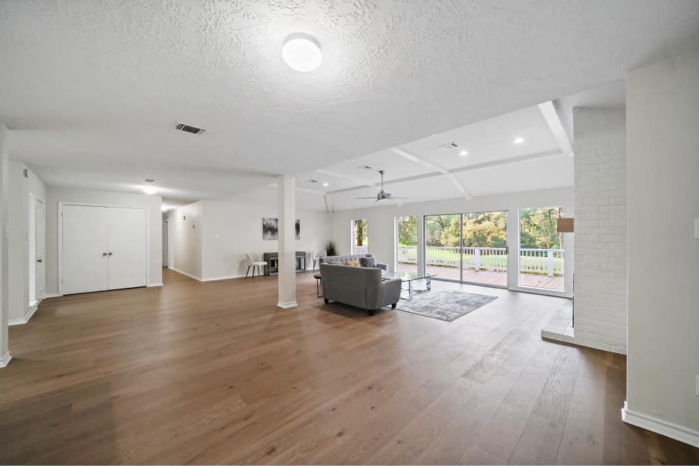
One of the biggest opportunities of this home was its incredible location surrounded by woods and the rolling greenscape of a nearby golf course. But despite so many exterior windows, the interior felt dark and cramped. So we designed an open floor plan to make the most of the home’s gigantic picture windows, flooding the interior with incredible natural light and spectacular views from every angle.
A new modern touch
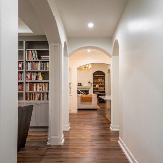
The interior space felt very much at home in the 60s. So to bring it up to speed, we started by removing the printed wallpaper to introduce a new, restrained color palette throughout the space. We replaced worn-out floors with custom hardwood planks to help ground and unify each room. This helped to utilize and accentuate the home’s architectural detailing, particularly the light-filled vaulted ceiling in the living room.
Dedication to detail
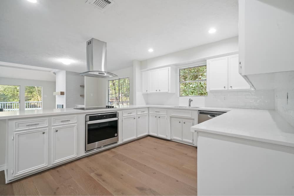
For a more cohesive and contemporary feel, we replaced every appliance and piece of hardware in the house, transforming the hodgepodge of different colors, materials, and finishes into a new, more tasteful collection of stainless-steel faucets, fans, and fixtures.
Radically better bathrooms
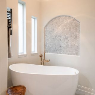
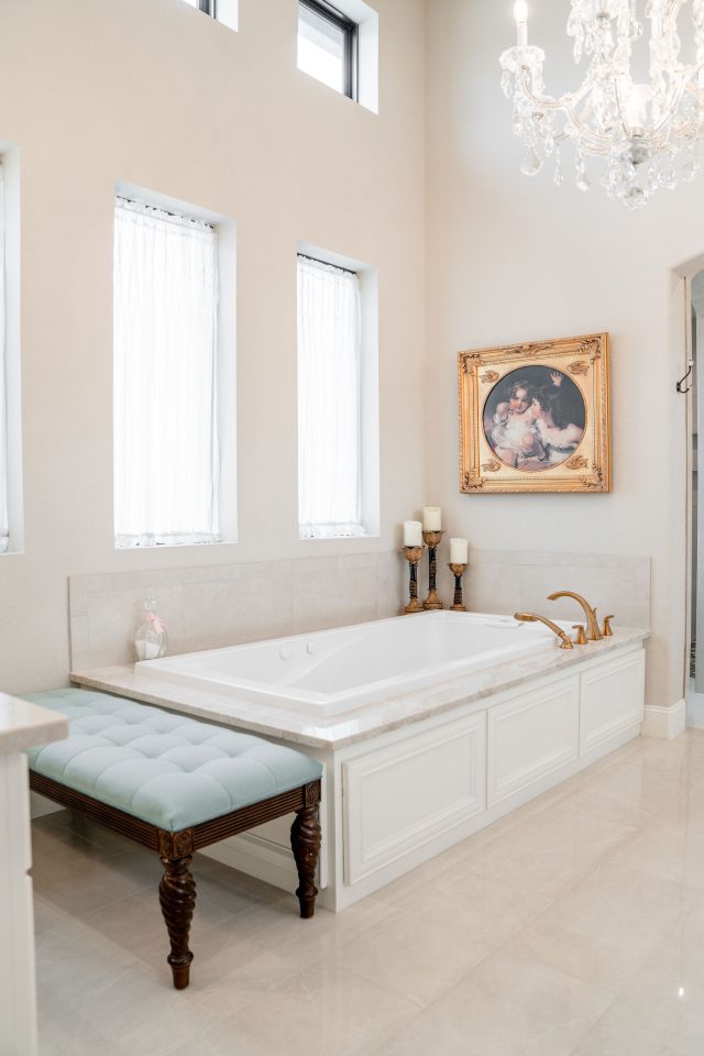
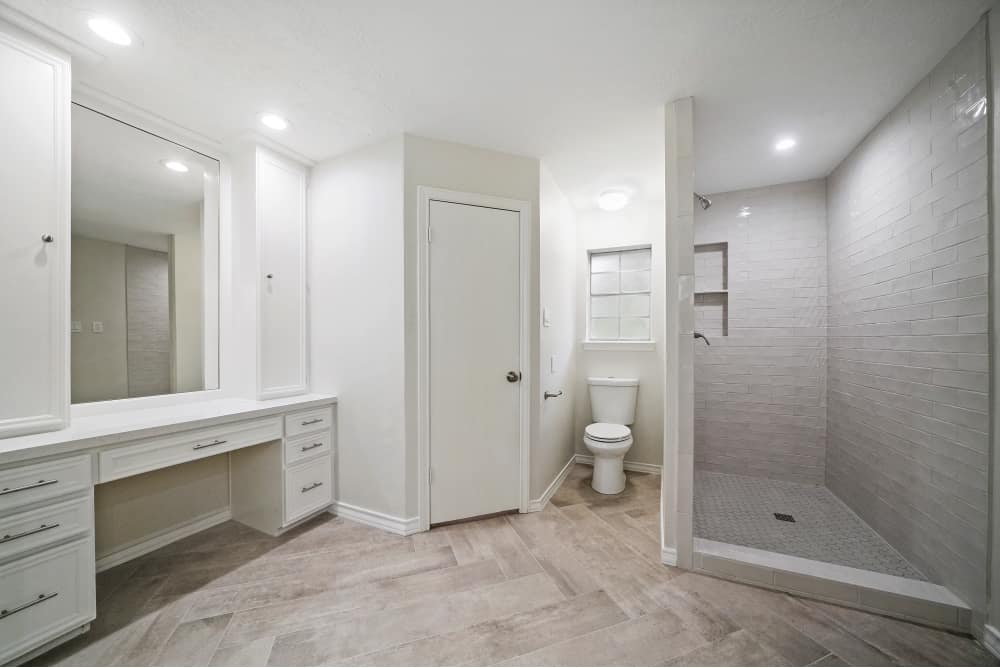
The bathroom transformations were particularly dramatic. We gutted the dark, cramped bathroom spaces and designed new vanities, lighting, and countertops to improve the light and overall feel in each one. In the master bath, we designed custom cabinetry and improved the layout to provide more space and smarter storage. Finally, for a more elevated look and feel, we introduced a custom chevron floor and expanded the extra-large walk-in shower.
From cramped to contemporary
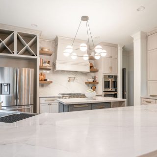
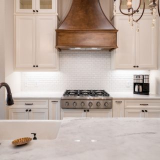
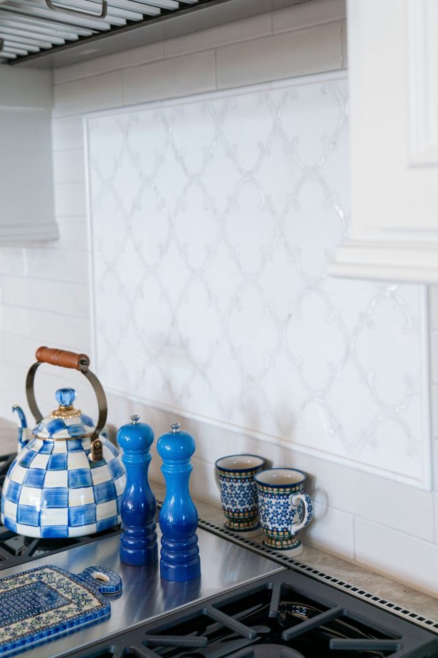
Reimagining what was a dark, confined space centering around one exterior window, we transformed the layout to create a spacious contemporary kitchen that basks in the newly harnessed natural light that floods the entire house. In addition, we expanded the prep space with new countertops, custom cabinetry, tile backsplash and an overhead oven vent.
Added taste and utility
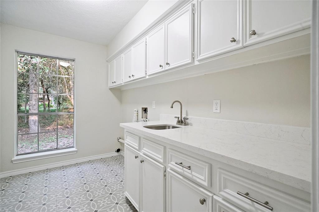
We breathed fresh life into a tired workspace—modernizing the overall aesthetic, overhauling the built-in cabinets, and introducing a beautiful new tile floor for added visual appeal. And for superior functionality, we also replaced the drab Formica countertop with a gorgeous, high-performance countertop, complete with a new sink and fixtures.
The greater outdoors
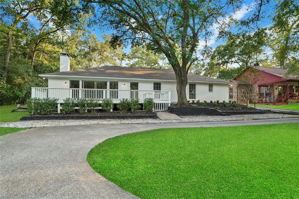
With so much exterior space to appreciate, we blew the lid off the back deck to enhance the incredible outdoor view. Additionally, we enhanced the visual quality and character of the entire brick exterior with a fresh coat of paint, contrasting window shutters, and new landscaping designs for added curb appeal.
